What is Area 51?
Area 51 is a Furniture store located in the Capital Hill area of Seattle. They specialize in selling Mid-Century Modern and Vintage pieces. Area 51 has a large stock of unique items that are priced above the average furniture store. Because of this, their target market is more specific than most furniture companies.
Objective
The current Area 51 website has not been updated for some years and could certainly use a revamped web presence. Their current website holds multiple issues.
- No way to purchase online
- No customer review
- Poor navigation
- Poor description of products
- Poor branding
- Site does not reflect product quality
- Bad description of company
Vision
Create an updated web presence that is visually appealing, quick to navigate, and draws in the audience of Area 51.
Role Screener, competitive comparative analysis, task analysis, interviews, affinity diagramming, persona creation, user journey, sketching, heuristics, storyboarding, site map, wire framing, user interface design, rapid prototyping, user testing.
Tools Sketch, Invision, Photoshop, Pen, and Pencil
Duration Two Week Sprint
Goals Understand the target user, effectively communicate brand, create clear, simple navigation, ability to purchase multiple items
Research and Analysis
To understand the scope of the task I started off by examining the current Area 51 website. During this process, I identified each feature that the site had to offer.
After this, I ran a competitive comparative analysis with Area 51 and two furniture websites, Wayfair, and Previously Owned by a Gay Man. Doing this gave me a better understanding of what Area 51's relation to the furniture sales market.
Screener
Next, I put together a screener to understand the shopping habits of different individuals. Doing this told me what people look for in a site, what features they use, and what elements determine whether they make a purchase or not.
Interview
I then put together an interview script based off of the responses I received from the screener. I came across a roadblock initially with some of my research. I found that a large number of the replies I received were from users who would not be inclined to shop at Area 51. They were younger in age, preferred a good deal over high-quality furniture, and were always moving so they did not view furniture purchases as investments. Area 51 sells rare, high-quality pieces for higher prices. I ended up changing my target user and sought people who were more well off and had particular tastes when it comes to buying goods.
After conducting multiple interviews with updates, my personas began to come together.
Primary
Secondary
Ideation
With my persona established, I created user flows, affinity diagrams, and scenarios to help me understand how the user will go about applying my solution. Once I had a firm grasp of my user and their needs, I moved onto the design.
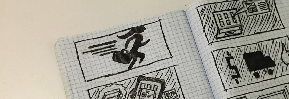
Storyboard
Design
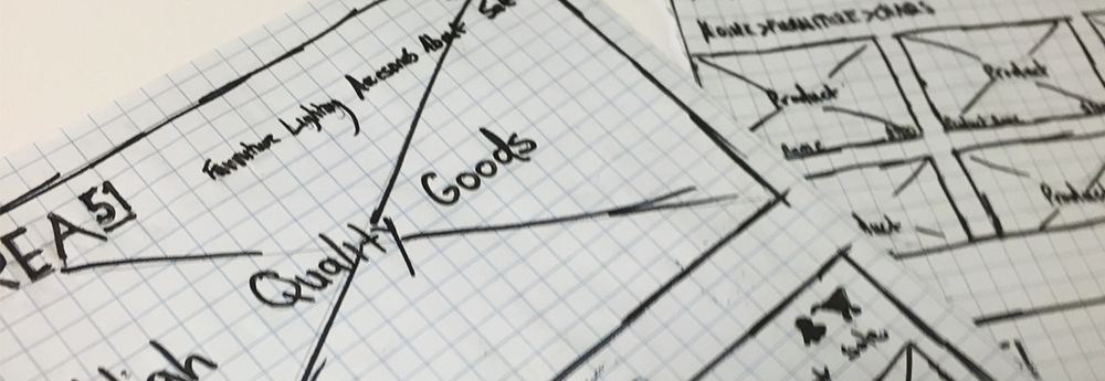
Sketching
I was able to nail down a consistent design after sketching multiple layouts and testing paper prototypes; I tested these on individuals until I felt comfortable with my design. After this, I went onto creating low-fi wireframe prototypes that showcased the user going through two distinct flows.
Usability
I moved onto testing my low-fi prototype with some of my targeted users. This process gave me valuable insight into areas of my designs that I overlooked.
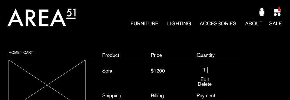
The prototype below includes two different flows. One in which the user goes through the process of adding a sofa to their cart, entering their shipping and payment info, and submitting a payment. The second flow includes the user signing up for a annual sales alert.
Solution
My solution is a high-quality product that focuses on the needs of its target audience. It is a simple, easily navigable website that leaves out the distractions and elements that bog down the shopping experience.
The newly updated Area 51:
- Easy to navigate, leaves out unneeded elements like "search functions," and "post to media" opportunities
- It allows the user to browse the companies collection quickly
- Includes detailed description of the product
- View multiple images of the product in the context of a room
- Easily purchase the product without having to signup for an account or email newsletter
What I learned
Area 51 has a specific target audience. My initial research did not reflect the correct user. They were younger in age, moved often, and preferred finding a sale over craftsmanship and seeing the purchase as an investment. Once I understood this, I knew that I needed to redesign elements of my research process to create successful personas
The power of testing in low-fi wireframe prototypes. I found far more bugs in my low-fi digital prototype; then I did with my paper prototype. I believe this is because the buttons and call to actions seemed much more realistic once viewed on a screen.


