What is Dive Around the Clock?
Dive Around the Clock (DATC) is a Non-Profit Organization with a community of scuba divers and volunteers located in the Seattle area. The group comes together once a year for a 24-hour underwater dive-a-thon relay. The purpose of the event is to raise funds for cancer research at Seattle Children's Hospital.
My Role Research and analysis, user interviews, Personas, Testing, Prototyping, Branding, Presentation
Tools Invision, Illustrator, Photoshop, Pen & Pencil
Duration 3 week sprint
Deliverables Research/Analysis, Information Architecture, User Testing, Persona Development, Branding, Copywriting, Updated Squarespace Template
Goals
- Improve site navigation
- Better communicate purpose of DATC
- Create consistent brand
- Design experience that allows users to quickly get involved
Challenge
Up until our collaboration, Dive Around the Clock had a low web presence. DATC needed an updated experience that would better help communicate the purpose of their organization, and quickly allow users to sign and participate in their event.
Solution
Our solution is an updated web experience that incorporates a revamped brand, voice, and navigation.
Research
- Created a survey for DATC community to identify how members got involved, why they dive, and their feelings about the current site
- Interviewed scuba divers not connected to DATC in order to understand what draws them to the activity
- User tested current DATC site with 18 users
- Performed Heuristic Evaluation against other popular nonprofit organizations
Old Site
Findings
Survey
Members communicated the need for better navigation and stressed the ability to sign-up to dive, donate, and/or volunteer for the event. We also recruited 8 active scuba divers who are not part of DATC community to interview.
Usability Testing of Old Site
Major Pain Points
- Confusion about the organization
- Difficult to navigate
- Poor description of what occurs at event
- Lack of relevant imagery
- Too text heavy
Analysis
We conducted an affinity diagram exercise to identify common dive themes, and how it relates to Dive around the Clock and the cause they support.
Persona's (Click to Enlarge)
Design
Sketching
After our data was collected, we went to the drawing board and sketched out different ideas. We mainly focused on the home, dive, donate, volunteer page as and the navigation bar.
Low-Fi Wireframes
We moved the sketches over to lo-fi mockups on inVision and conducted 3 different usability tests on 19 different target users.
We asked them to go through three different flows (demonstrated below) to pinpoint exactly where people were still having trouble.
Response
Users still confused on what the site is about based on the home screen
Users still don't understand what the event is about
Each iteration changed based on user feedback
Took feedback to further our final design
Branding
We initially understood that DATC did not have a consistent brand. We thought it would be most helpful for the organization if they had a cohesive identity with which they could use to expand their community. With a background in Visual Design, I took on putting together a new branding system for Dive Around the Clock. We also recognized the copy of our client's current site did not successfully communicate the mission of DATC. Because of this, we began to update the copywriting of the site.
Website
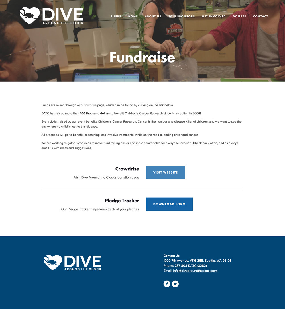
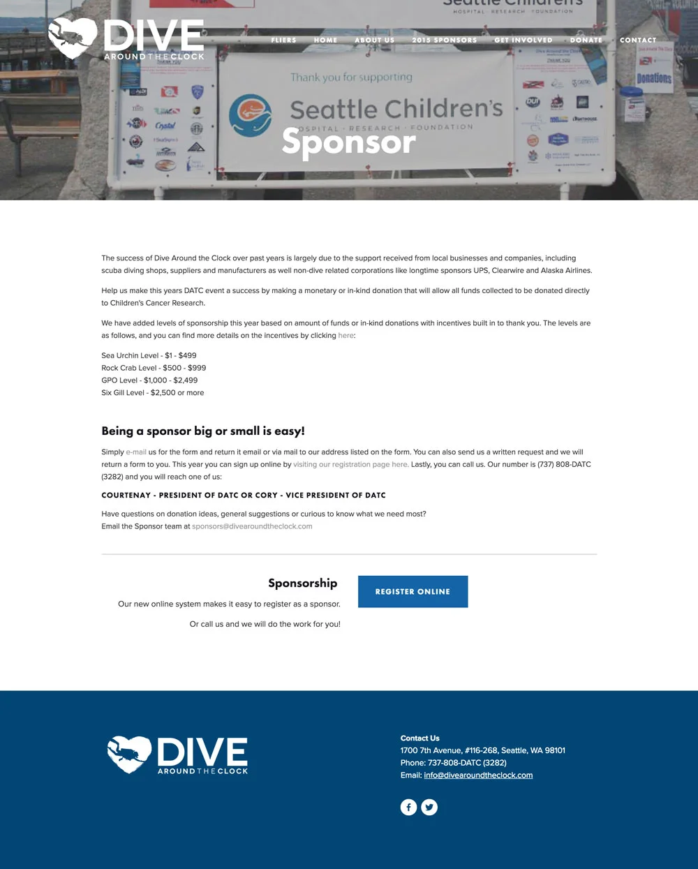
With our brand and layout nailed down, we began to translate the new identity into an updated Squarespace. In the first version, we placed a small paragraph explaining what the event is about, however during our testing we noticed people glanced over large chunks of text, so to fix that, we condensed the mission statement as well as the event summary into small graphics that made it easier for the users to digest.
Other changes
- Condensed copy after noticing users glanced over large groups of copy in testing
- Added multiple calls to action for Dive, Volunteer, Donate, and Sponsor on front page
Testing
We were pleased to find that our users could quickly understand the cause of Dive Around the Clock, and perform the major roles outlined by our client; dive, donate, and volunteer.
Solution
Our solution is a functioning website with an updated design and identity. The site is easy to navigate and understand. The updated identity is a strong reflection of the Dive Around the Clock community. Our client was ecstatic with our product and has already begun to implement it into their organization.


